Chasing breakpoints in the browser
When making a responsive website, we have to decide when to insert breakpoints to adjust the design to new screen dimensions. The first option that comes to mind is to base those breakpoints on devices specifications. After all, that's where our designs will be displayed.
In the ocean of phone or tablets — hold in landscape or portrait orientation —, netbooks, latptops, desktops, TVs, consoles, how can we choose which screen sizes are more relevant to our size? Even if we use statistics about our users, what guarantees us than relevant resolutions today will still be relevant tomorrow, in a week, in a couple of month?
In the end, we do not design a website for people with a 1024x768 browser or using a Nexus 7 tablet. We need to cater for every kind of screen. So instead of using "external factors" to guide our breakpoints, we can use something we actually have (at least some kind of) control on: the content of the website. We can see it reshaping as the screen size change, and introduce breakpoints as it starts looking bad.
For example, say we have this simple situation: a paragraph followed by a list of items:
In a narrow viewport, having the list items stacked on top of each other works just fine. But as the screen grows wider, the items get more and more space on the right. It doesn't look quite right. It might look better with the items in two columns instead, or putting the list on the left or right of the paragraph.
Once we've decided how to sort it out for wider screens, we still need to find out which width should trigger the new design. My preferred way is to experiment in the browser, using the dev tools. I have a preference for Firefox and its responsive design view but Chrome dev tools work just as fine, especially if docked right (and I guess Opera dragonfly does the trick too).
Using the style editor in the dev tools, I add the rules that adjust the design for wider screens. Then I play with the width to see at which point it starts looking off when screen gets narrower. At that point, I check the narrower design still looks alright —commenting the new rules —. If it does, I've got my breakpoint, win! If it doesn't, I tinker a little more with the width, looking for a point where the narrow design still looks good before and the wider design works well after. Rince and repeat with the other elements or at larger width when the element breaks again.
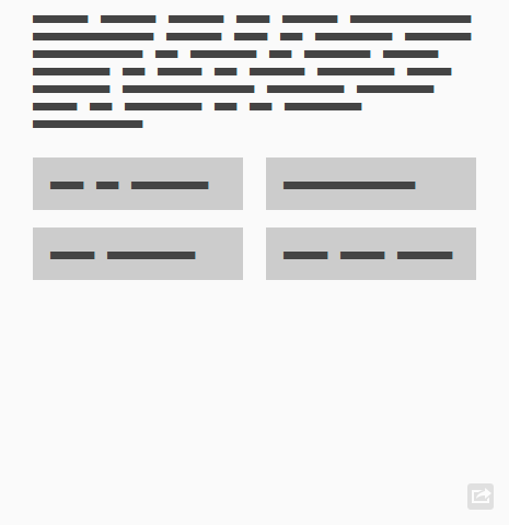
For the example, this method made me discover the list "broke" at 375px. I could have introduced the 2 columns starting at 320px (old iPhone portrait width) but it makes them to narrow to contain long words. Or I could have started at 480px (portrait width of some Android phones), but that left a lot of white space on the right for viewports between 375 and 480px. Instead, letting the content drive the breakpoints allowed the best design possible whatever the user's viewport size.
In the end, it's still trial and error. I've yet to find a magic reasoning that leads to "Of course, this design will need horizontal breakpoints at 525, 875 and 945px" without actually resizing the design at various width and seeing what happens. To do that, the browser feels the best tool to me. It will reflow the elements when you resize the screen, you can edit the CSS and it's what the users will use to see the site after all.
I'd be really interested to hear about your methods for defining the breakpoints of your responsive websites? Maybe someone has a more mathematic approach? Maybe other tools? Let me know in the comments!